Space Station • Concept 2025
A brand for a space themed late-night cafe
- Role
- Brand Design
- Timeline
- July to December 2025
- Team
- Solo
- Tools
- Figma, Illustrator, Nano Banana
- Client
- ilovecreatives Graphic Design Course
Space Station is a brand for a made-up cafe that comes alive at night. It's for people who want calm at the end of the day, not a jolt. I made it alone for the ilovecreatives Graphic Design Course.
The cafe is fictional, but the brand is finished.
Problem
Space themes usually turn cold, and a place to unwind can't be.
A space cafe is easy to make cold: chrome, black and neon. It looks great in a photo but feels bad at eleven at night.
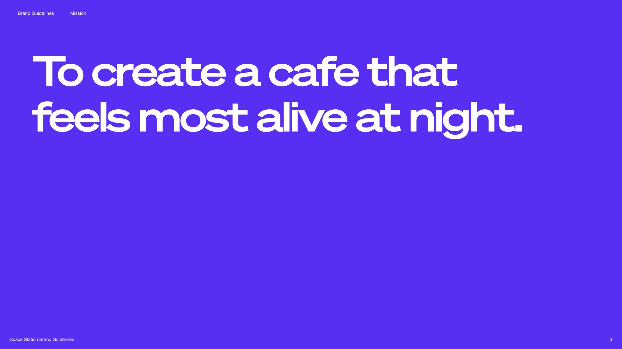
So my rule was to hold two feelings at once. A little adventurous, and completely comfortable.
Process
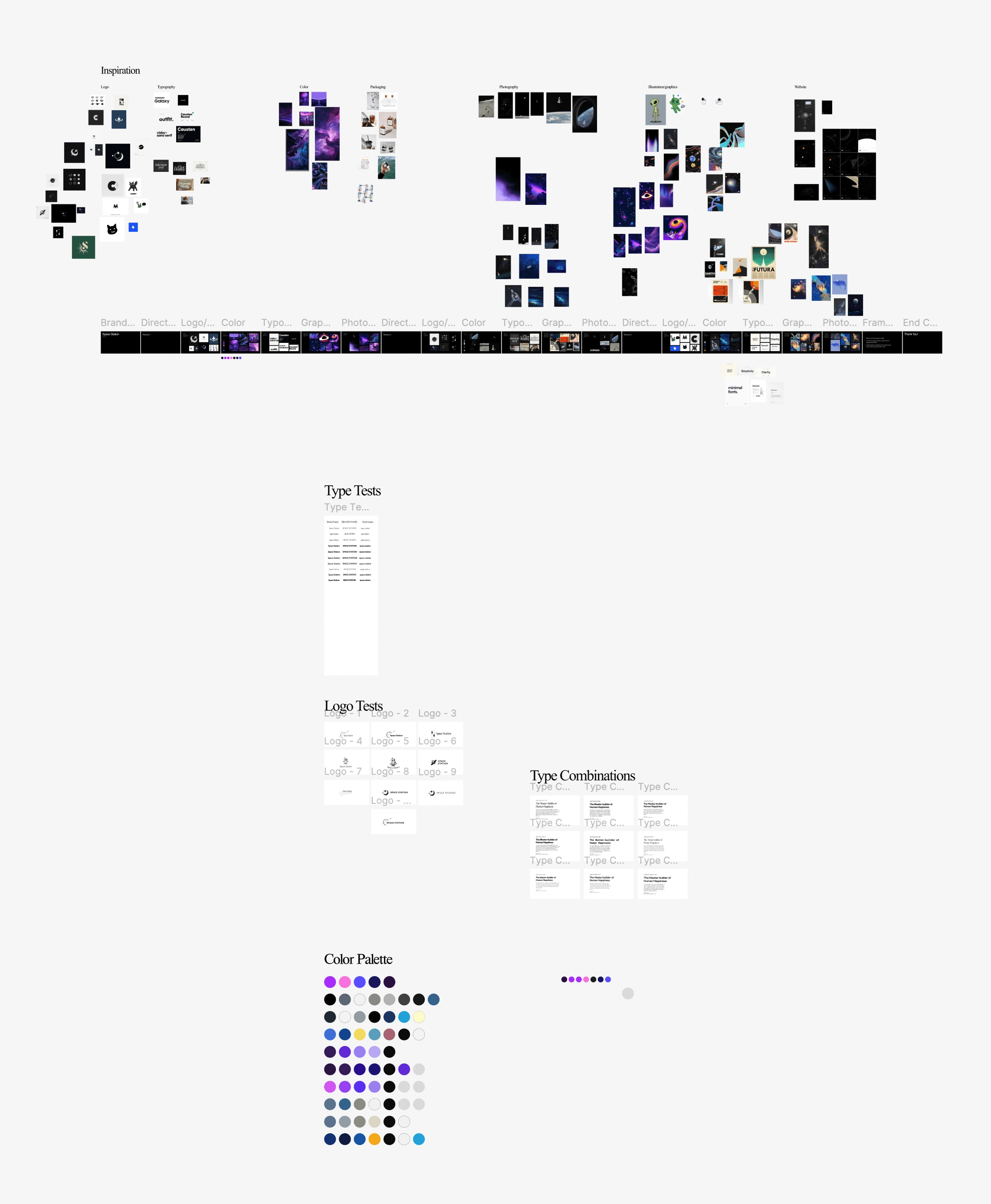
I kept the palette violet, not black, so deep space still feels warm.
I built the colors around violet and paired them with a wide, retro typeface. Together they feel exciting and safe at the same time.
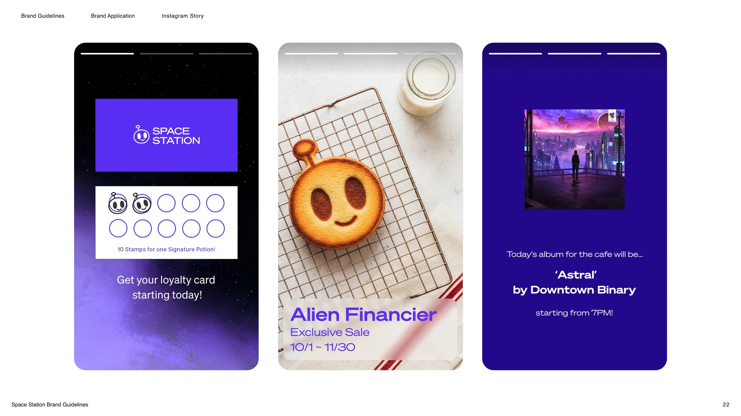
The social feed keeps the same night owl mood. Scrolling should feel like sitting in the room.
Process
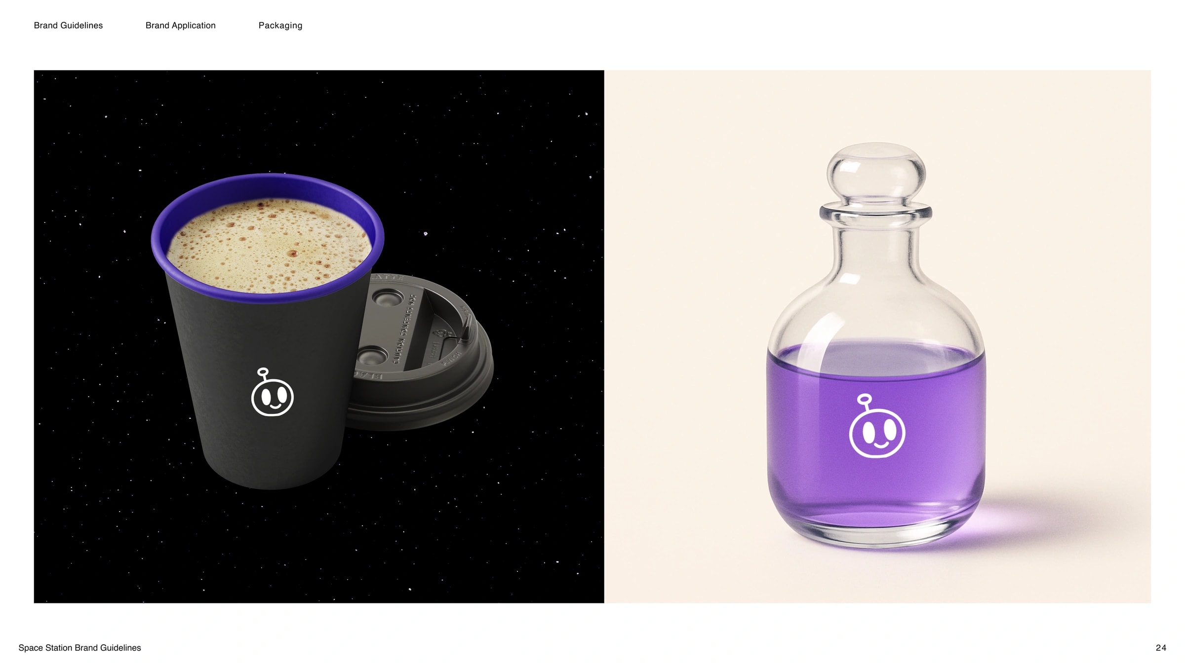
Signature drinks come in potion bottles, and the mark stays small.
Everyday orders get a black cup. Signature drinks come in glass potion bottles, so the menu feels like part of the story. The mark stays small, like a character, not a stamp.
Reflection
Critique pushed it past space clichés. I'd test the palette after dark next time.
Peer critique in the course pushed me past the obvious space ideas, round after round.
Next time, I'd test the colors in a dim room early. A brand that lives after dark should be judged after dark.