Provecho • Preview 2026
A website that sells a San Diego roaster's coffee
- Role
- Product & UX Designer, Design Systems & Brand, User Research, Design Engineer
- Timeline
- April to June 2026 (10-week studio), then a solo build
- Team
- Sally Moon, Rayleen Marquez, Alela Rathsasombath
- Tools
- Figma, FigJam, Astro, TypeScript, Matter.js, Vercel, AI-assisted development
- Client
- Provecho!Visit project ↗
- User interviews plus a competitive teardown before any screens
- 9
- High-fidelity mobile screens held together by one design system
- 38
- April to June 2026, with a real client sign-off on the brief
- 10 weeks
Provecho! is a Latina-founded coffee roaster in San Diego. My team of four designed their new site in ten weeks. Then I built it alone.
I led the competitive research, the brand, the design system and the Coffee Quiz.
Problem
Their story came through in person, but not on their website.
Karem and Gerardo's story wins people over in the cafe. Their old site confused buyers and never even named them.
Their top ask: make the story show up on the site. The rules: no drink menu, no partner logos, and photos from one busy owner.
Process
I made the coffee quiz its own page, not a subscription trap.
Early plans hid the coffee quiz inside the Subscribe page. I pushed back. Our research said these buyers hate pressure.
So it got its own page, one question per screen. The result shows your match, then Add to cart, with no subscription pitch.
Process
I built the design system first so 38 screens stayed together.
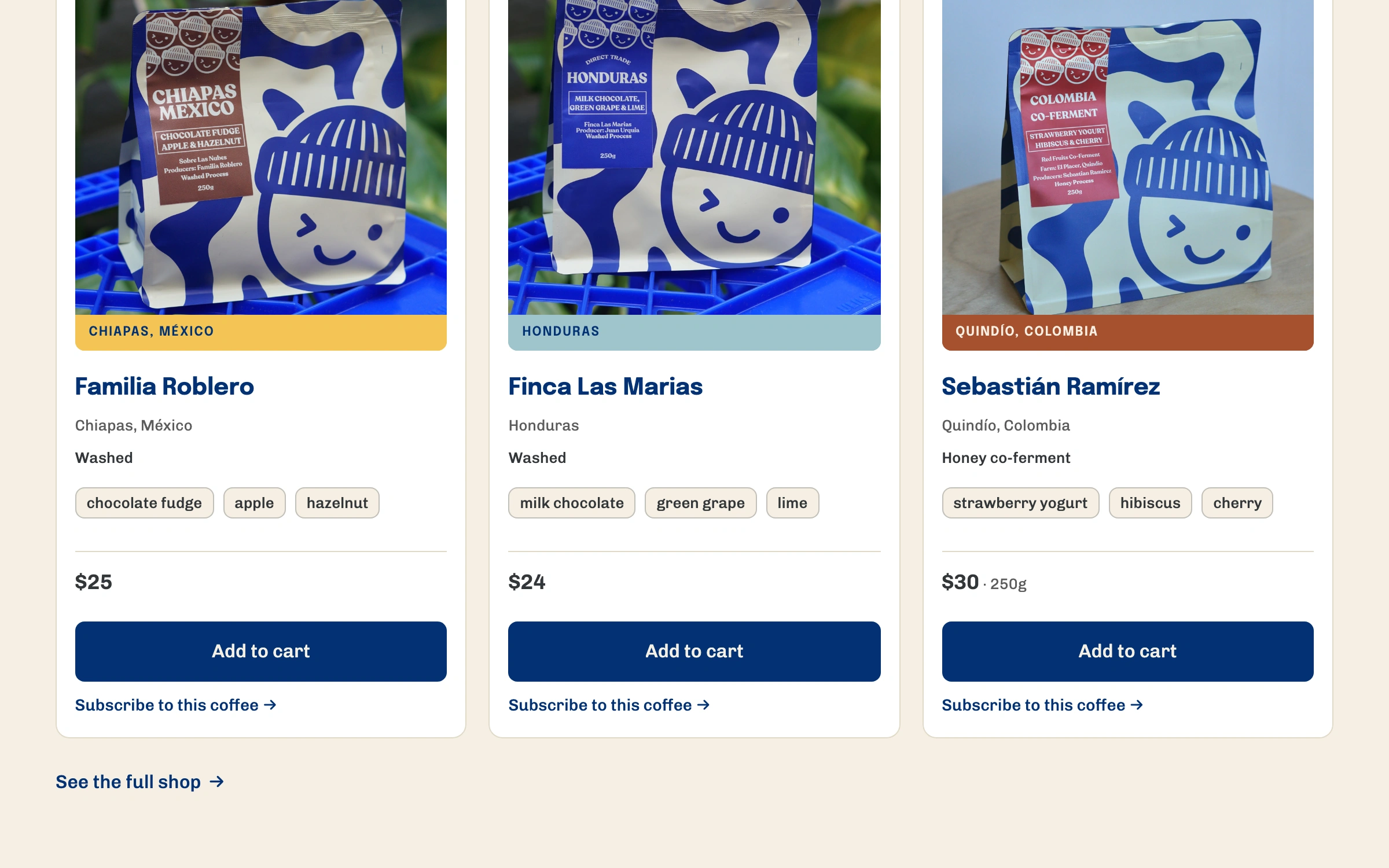
Four of us made about 38 screens. So I built the system first: colors, type, spacing, and one bean card for everything.
A fix in one place fixed every page. But a footer bug slipped onto all of them, so you still check the whole file.
Process
Then I built it for real and cut the partner form to three fields.
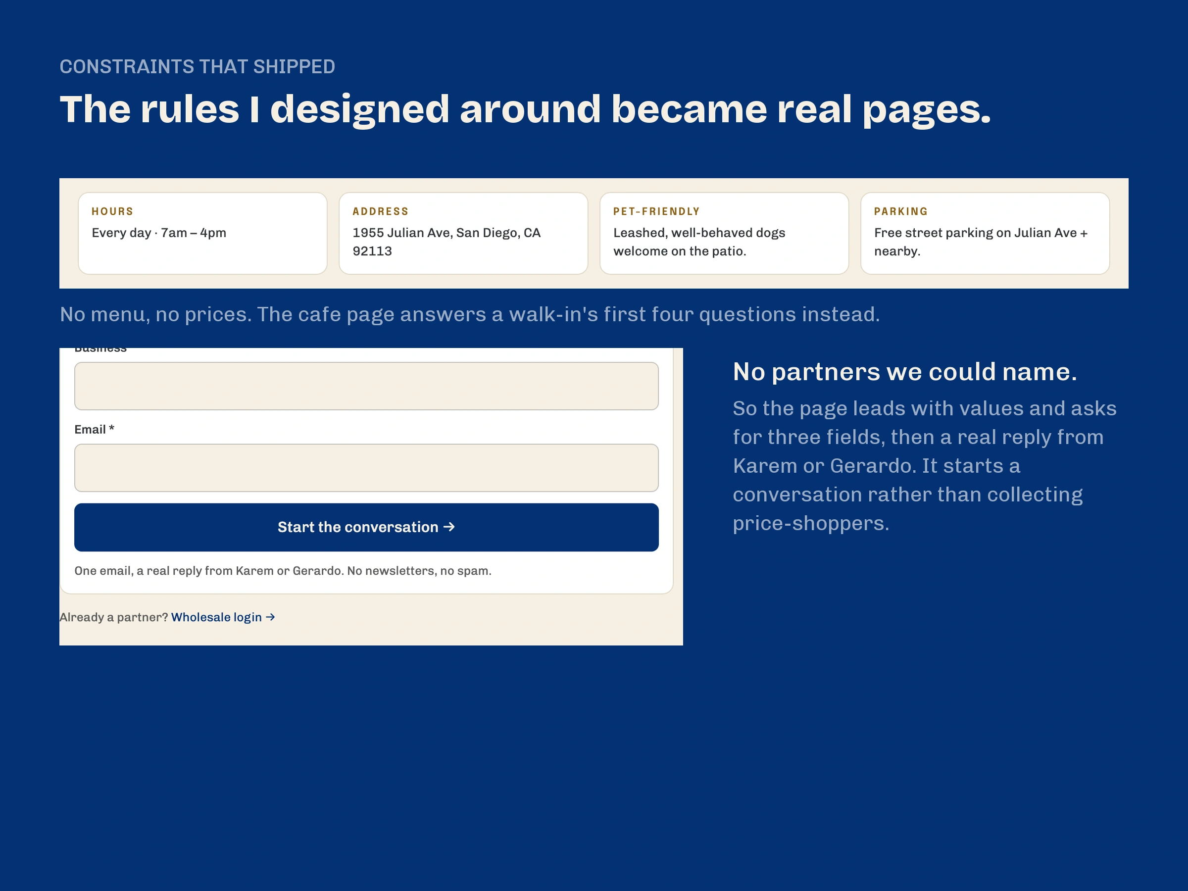
A prototype is only a proposal. So I built the site in Astro. The cafe page skips the menu and answers hours, address, dogs and parking.
I cut the long wholesale form to three fields and a promise that Karem or Gerardo will reply.
Final Design
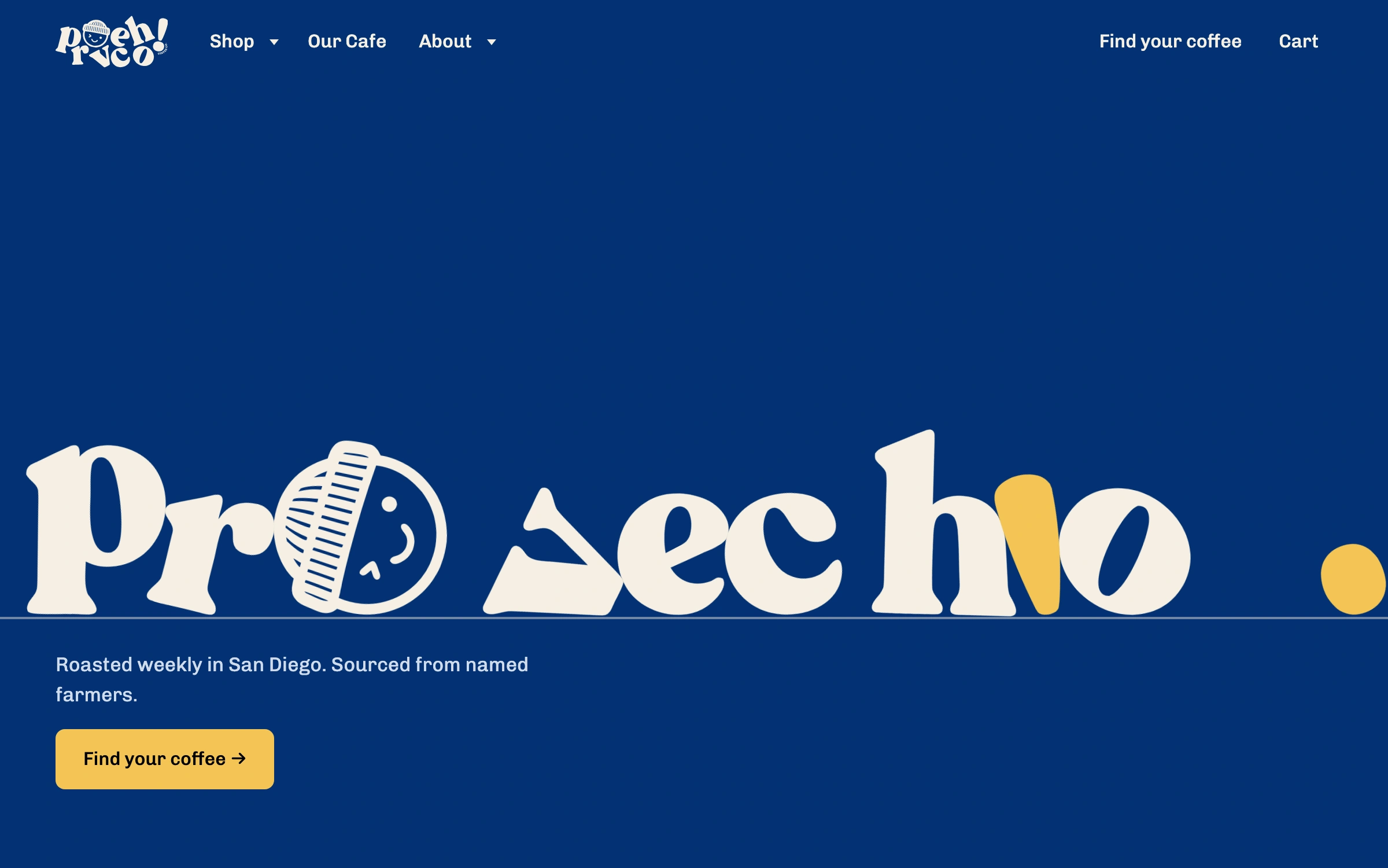
The logo falls into a pile, and you can pick it up.
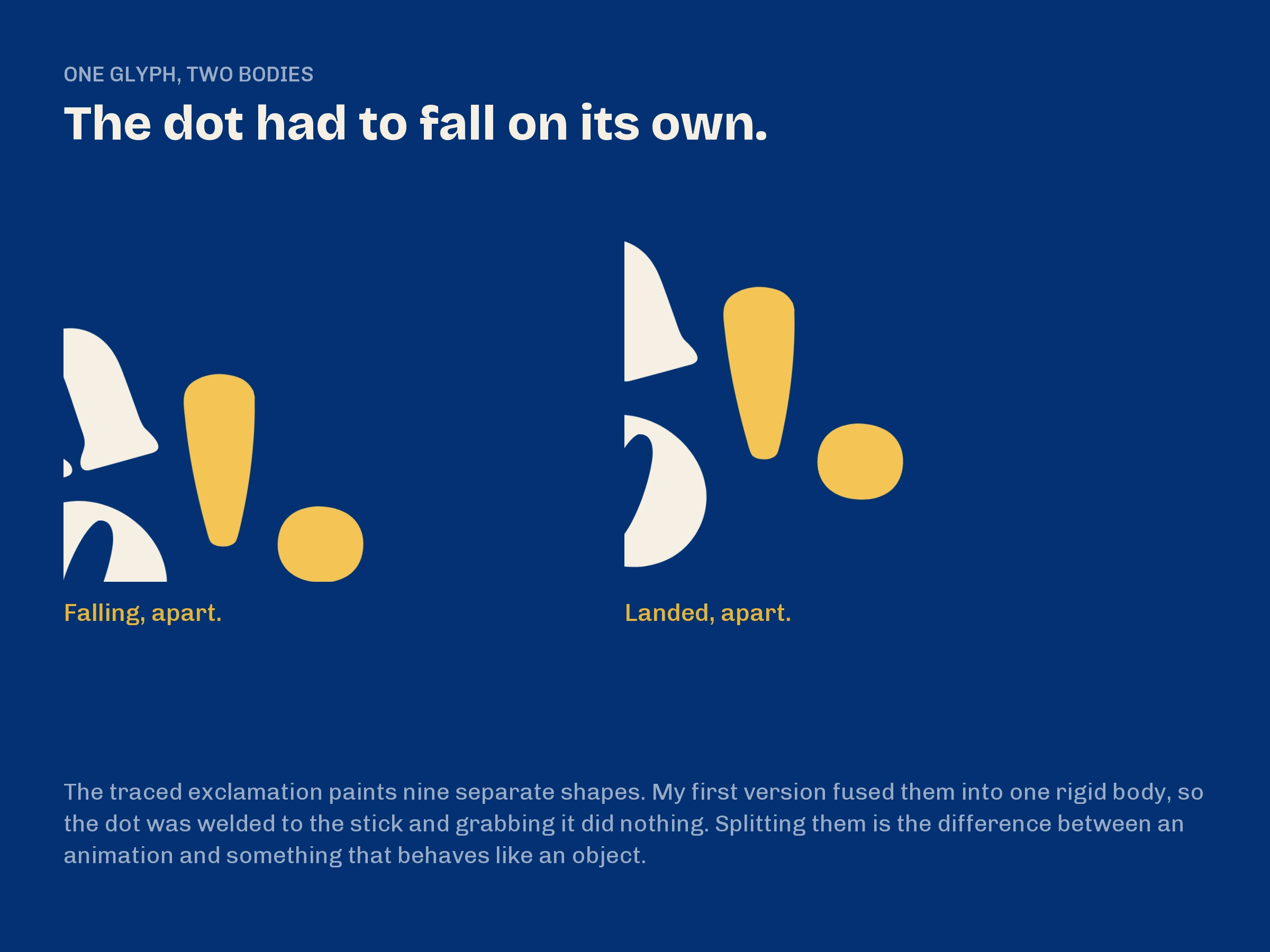
The nine letters of ¡Provecho! drop into a heap you can drag around. A still logo couldn't carry the founders' warmth.
If you turn on reduced motion, none of it runs.
Reflection
Deployed and waiting on the client. Content was the real bottleneck.
Photos, prices and the founders' video all waited on one busy owner. Next time, I'd name an owner for each piece of content in week one.
I planned user tests, but I haven't run them yet.