Designed for Margaret • Concept 2026
A simpler prescription refill flow for adults over 65
- Role
- UX Design, Accessibility, Usability Testing
- Timeline
- May 2026
- Team
- Isabelle, Alisa
- Tools
- Figma, WCAG 2.1
- Client
- Better by Design, UCSD Cognitive Science
- Places the current flow would stall an older first-time user
- 7
- Steps in the redesign, one question each
- 4
- Of older adults who don't take medication as prescribed (Stuck et al., 2017)
- 41%
A redesign of the CVS app's refill flow for adults over 65. Three of us made it for a UCSD class in May 2026. It's a prototype, not a shipped change.
I designed the pharmacy home, the type-the-number step and the pickup step, and did the final accessibility pass.
Problem
The refill flow was built for people who grew up with phones.
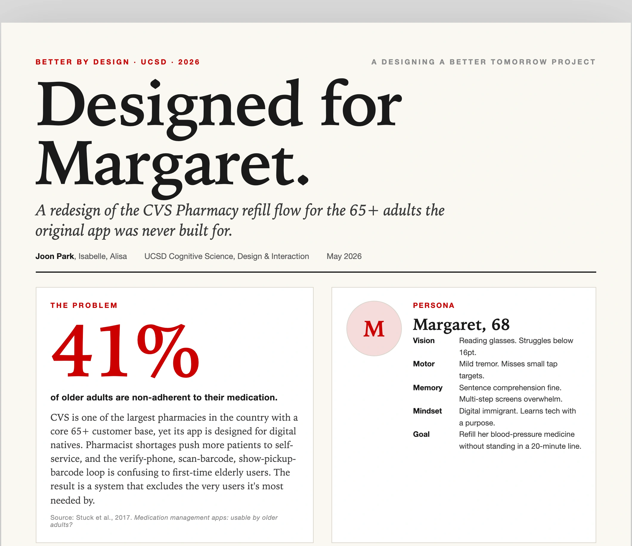
Refilling takes three hard steps. You verify a phone number, scan a barcode, then show another barcode at pickup. That loop loses a first-time older user.
Process
One question per screen, typing equal to scanning, and plain verbs.
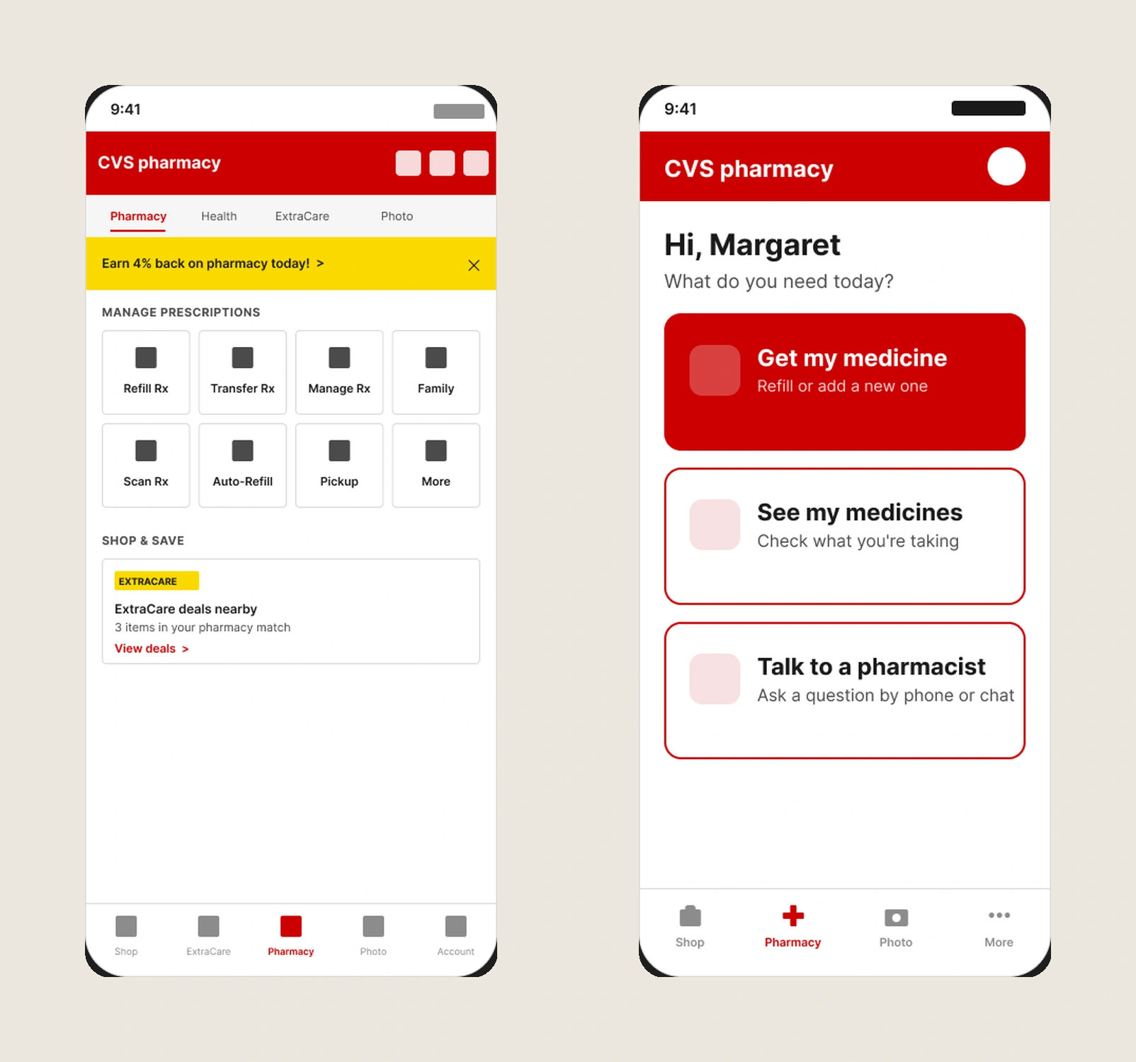
We designed for Margaret, a persona with reading glasses and a mild tremor. One question per screen, so she never holds too much in mind. Typing the number counts as much as scanning, for unsteady hands. And plain verbs: "Get my medicine," not "Refill."
Final Design
One question per screen, with big targets and plain words.
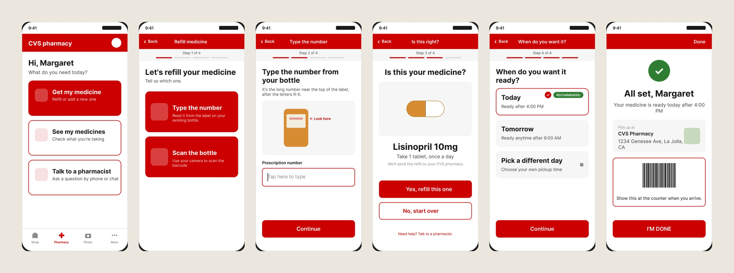
A pharmacy home, then four steps. You choose how to add the medicine, type the number, confirm it, and pick a time. It ends on "All set, Margaret".
Reflection
No session with an older adult ran. I'd run it before polishing next time.
We wrote a test plan but never ran it. So nothing here is a usability result. One hour with someone over 65 would test our main trade. More screens, but less to hold in your head.